
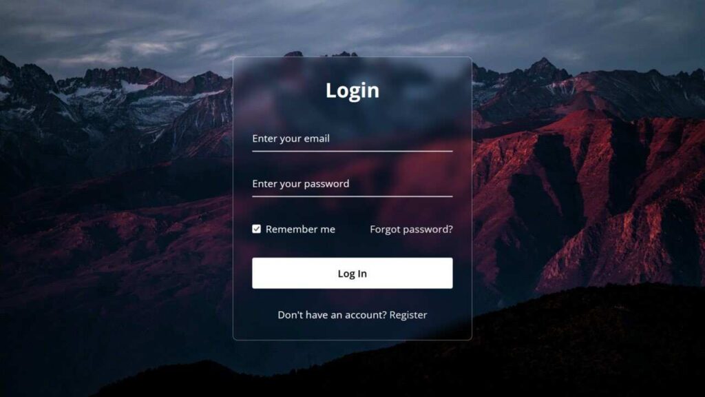
You’ve probably come across stylish glassmorphism effects on login forms, cards, and other UI elements across modern websites. But as a beginner web developer, have you ever thought about building your own login form using this eye-catching design trend?
If you’re new to the term, glassmorphism is a popular UI trend that creates the appearance of frosted or semi-transparent glass. It combines translucency, background blur, and subtle shadows to give components a sleek, modern, and layered feel—making your interface stand out while maintaining clarity and elegance.
HTML Code
<!DOCTYPE html>
<html>
<head>
  <meta charset="UTF-8">
  <meta name="viewport" content="width=device-width, initial-scale=1.0">
  <title>Glassmorphism Login Form | Mudasir Azhar</title>
  <link rel="stylesheet" href="style.css">
</head>
<body>
  <div class="wrapper">
    <form action="#">
      <h2>Login</h2>
        <div class="input-field">
        <input type="text" required>
        <label>Enter your email</label>
      </div>
      <div class="input-field">
        <input type="password" required>
        <label>Enter your password</label>
      </div>
      <div class="forget">
        <label for="remember">
          <input type="checkbox" id="remember">
          <p>Remember me</p>
        </label>
        <a href="#">Forgot password?</a>
      </div>
      <button type="submit">Log In</button>
      <div class="register">
        <p>Don't have an account? <a href="#">Register</a></p>
      </div>
    </form>
  </div>
</body>
</html>
CSS Code
@import url("https://fonts.googleapis.com/css2?family=Open+Sans:wght@200;300;400;500;600;700&display=swap");
* {
  margin: 0;
  padding: 0;
  box-sizing: border-box;
  font-family: "Open Sans", sans-serif;
}
body {
  display: flex;
  align-items: center;
  justify-content: center;
  min-height: 100vh;
  width: 100%;
  padding: 0 10px;
}
body::before {
  content: "";
  position: absolute;
  width: 100%;
  height: 100%;
  background: url("login-hero-bg.jpg"), #000;
  background-position: center;
  background-size: cover;
}
.wrapper {
  width: 400px;
  border-radius: 8px;
  padding: 30px;
  text-align: center;
  border: 1px solid rgba(255, 255, 255, 0.5);
  backdrop-filter: blur(8px);
  -webkit-backdrop-filter: blur(8px);
}
form {
  display: flex;
  flex-direction: column;
}
h2 {
  font-size: 2rem;
  margin-bottom: 20px;
  color: #fff;
}
.input-field {
  position: relative;
  border-bottom: 2px solid #ccc;
  margin: 15px 0;
}
.input-field label {
  position: absolute;
  top: 50%;
  left: 0;
  transform: translateY(-50%);
  color: #fff;
  font-size: 16px;
  pointer-events: none;
  transition: 0.15s ease;
}
.input-field input {
  width: 100%;
  height: 40px;
  background: transparent;
  border: none;
  outline: none;
  font-size: 16px;
  color: #fff;
}
.input-field input:focus~label,
.input-field input:valid~label {
  font-size: 0.8rem;
  top: 10px;
  transform: translateY(-120%);
}
.forget {
  display: flex;
  align-items: center;
  justify-content: space-between;
  margin: 25px 0 35px 0;
  color: #fff;
}
#remember {
  accent-color: #fff;
}
.forget label {
  display: flex;
  align-items: center;
}
.forget label p {
  margin-left: 8px;
}
.wrapper a {
  color: #efefef;
  text-decoration: none;
}
.wrapper a:hover {
  text-decoration: underline;
}
button {
  background: #fff;
  color: #000;
  font-weight: 600;
  border: none;
  padding: 12px 20px;
  cursor: pointer;
  border-radius: 3px;
  font-size: 16px;
  border: 2px solid transparent;
  transition: 0.3s ease;
}
button:hover {
  color: #fff;
  border-color: #fff;
  background: rgba(255, 255, 255, 0.15);
}
.register {
  text-align: center;
  margin-top: 30px;
  color: #fff;
}